Thicket Visualization Demonstration
Top-down Analysis
In this gif we demonstrate the top-down analysis visualization. Each top-down metric is color-coded. The colors associated with each metric are shown by the legend at the top of the visualization.
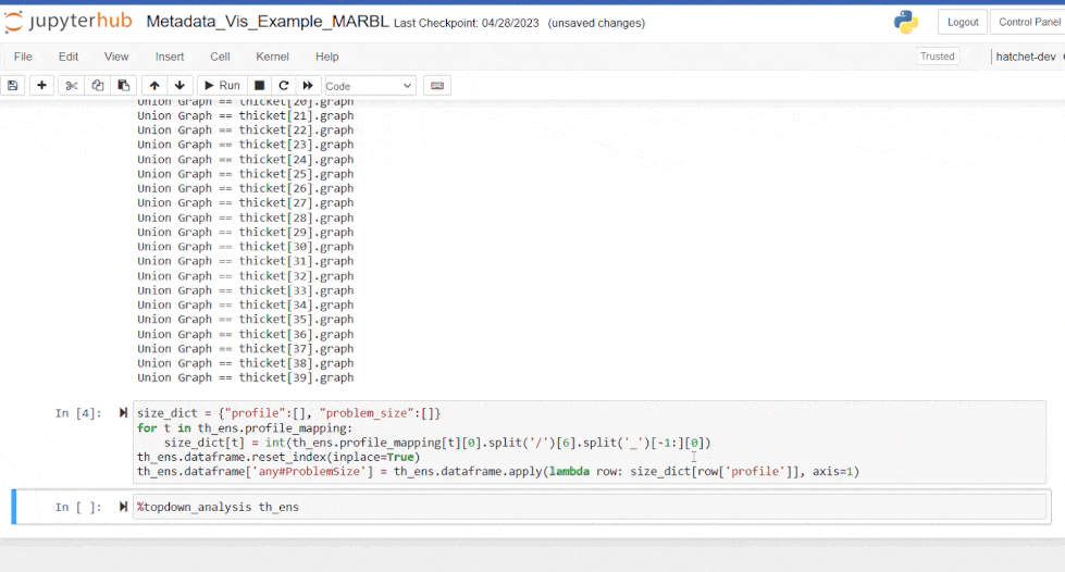
This visualization shows how the distribution of topdown metrics associated with each node changes as the problem size increases. Each group represents a series of trials at a given problem size and each bar represents a single profiling run.
Near the end of the gif we see a series of run which become more backend bound as the problem size increases; highlighting an opportunity for optimization.
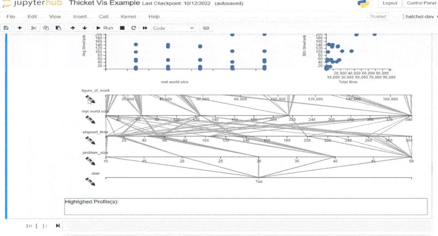
Parallel Coordinates Plot
The visualization is then initialized using the %metadata_vis magic command. This command has multiple arguments. The Thicket we are visualizing, the specific metadata we are interested in, and the node metrics which the scatter plots will show. Initially the parallel coordinates are empty until we select runs from a scatterplot.
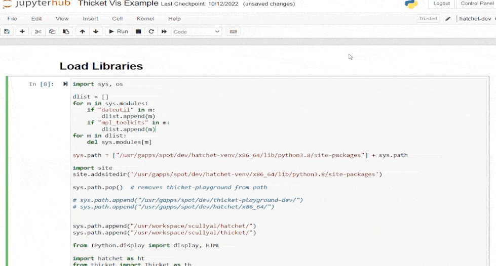
In this gif, we show the loading of libraries into our notebook and the subsequent loading of data into a thicket object.
The left scatterplot plots a metric against one metadata value to provide a perspective of how an independent variable may impact the measured performance across a range of runs. The right scatterplot plots two metrics relative to one another. The axis can be changed using the dropdown menus above each chart.
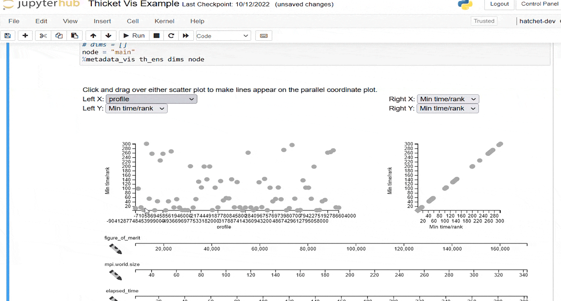
To populate the lines on the parallel coordinate plot, a user brushes over one of the scatterplots. Either scatterplot can be brushed over. In this example, we select all the data points but fewer can be selected at a time.
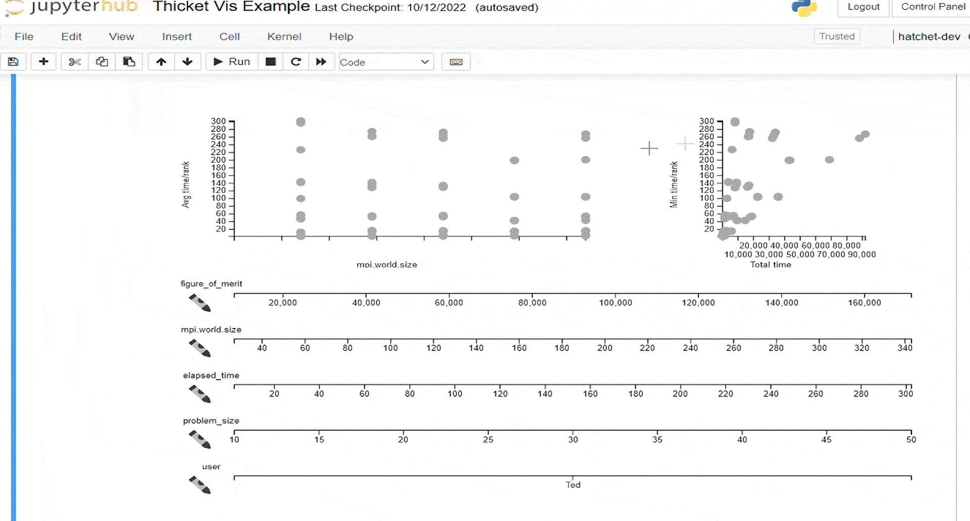
To better identify patterns of behavior linked to specific metadata across all metadata values, we provide a means to color profiles by a particular metadata field. A user may click on any of the crayon icons to the left of a parallel coordinate axis to color all lines and dots in the scatterplot according to that metadata field.
Quantitative variables are colored on a spectrum from light to dark green. Categorical variables are colored with a discrete color map. In this case, we have only one “user” who is colored blue.
At the end of this gif, we demonstrate sub-selecting a group of large parallelism and large runtime profiles.